Event Agency Branding
Ilyich Group
As Ilyich Group continued to grow, the agency needed a brand that would match the scale and quality of its work. The objective was to create a modern and flexible identity system capable of unifying all communication channels, strengthening market recognition and supporting future business development.
Industry: Event
Location: Russia
Company size: 20+
Year: 2024
Before developing the visual identity, we conducted a comprehensive analysis of the event and creative agency market, studying competitors, industry trends and audience expectations. Particular attention was paid to identifying visual clichés commonly used in the industry and uncovering opportunities for differentiation.
The research helped define a positioning that reflects Ilyich Group’s creative approach, flexibility and large-scale production capabilities. These insights became the foundation for a distinctive visual system designed to stand out in a highly competitive market while remaining scalable across digital, corporate and event communications.
The research helped define a positioning that reflects Ilyich Group’s creative approach, flexibility and large-scale production capabilities. These insights became the foundation for a distinctive visual system designed to stand out in a highly competitive market while remaining scalable across digital, corporate and event communications.
ILYICH is a full-service creative agency for businesses and small enterprises. The agency focuses on event management and communication design, turning the boldest concepts into reality in the areas of events, marketing, and IT.
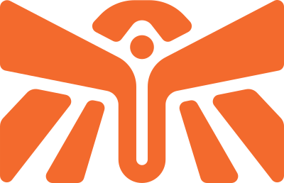
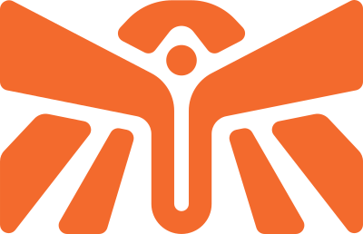
The naming and logo of Ilyich are associated with simplicity, elegance, and quality, which are characteristic of the Soviet era. Soviet design elements, such as contrast, complex rhythm, and mosaics, can emphasize the uniqueness and exclusivity of the services. The wing used in the logo represents creativity and freedom of thought, while the soft sign in the form of a Soviet sickle symbolizes the team’s hard work.
The corporate identity is based on two colors: carmine and licorice. It is at the intersection of these colors that ILYICH’s corporate identity is developed.
By combining these contrasting colors and approaches, ILYICH provides services that cater to clients in various industries.
- Carmine is a determined, extravagant, and status-conscious color that embodies creativity and high quality.
- Licorice, on the other hand, is a color of confidence and authority, reflecting the stability that has been present throughout ILYICH’s rich history. These two colors contrast and create a sense of creativity, but also stability and elitism.
By combining these contrasting colors and approaches, ILYICH provides services that cater to clients in various industries.
You may also want to check this out
Start a Project
Tell us a little about your project and leave your contact details. We’ll get back to you shortly to discuss the next steps.
Let’s Talk About Your Project
Tell us a few details and we’ll get back to you with the most suitable next steps.
Let’s Talk About Your Project
Tell us a few details and we’ll get back to you with the most suitable next steps.
Let’s Talk About Your Project
Tell us a few details and we’ll get back to you with the most suitable next steps.
Let’s Talk About Your Project
Tell us a few details and we’ll get back to you with the most suitable next steps.